Why Color Is the Most Powerful Branding Tool
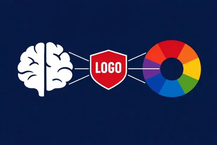
Color is the first thing our brain processes when we see a logo. Before we read the text, before we analyze the shape, we register the color. Studies show that color increases brand recognition by up to 80%, making it the single most important element of visual branding.
Different colors trigger different psychological responses. These aren't arbitrary — they're rooted in evolutionary biology, cultural associations, and decades of marketing reinforcement. Understanding color psychology is essential for anyone involved in branding or design.
Blue: Trust and Professionalism
Blue is the most popular color in corporate logos, used by approximately 33% of the world's top brands. Companies like Facebook, LinkedIn, IBM, Intel, Samsung, and PayPal all rely on blue.
The reason? Blue universally conveys trust, reliability, and professionalism. In a digital age where companies handle sensitive personal data, blue signals that a company is trustworthy and stable. There's also a practical reason: blue is the least likely color to cause visual fatigue on screens.
Test Your Knowledge!
Think you can identify all these logos? Try Logo Quiz and put your skills to the test.
Play NowRed: Energy and Urgency
Red is the second most popular logo color, used by about 29% of top brands. Coca-Cola, YouTube, Netflix, Nintendo, and CNN all use red as their primary brand color.
Red is physiologically stimulating — it actually increases heart rate and creates a sense of urgency. This is why it's so effective for food brands (triggering appetite), entertainment brands (suggesting excitement), and retail (creating urgency to buy).
Studies show that red call-to-action buttons convert up to 21% better than green ones — a direct application of color psychology in digital design.
Green, Yellow, and Beyond
The Full Spectrum of Brand Color
Green conveys nature, health, and sustainability. Brands like Whole Foods, John Deere, and Starbucks use it to signal freshness and environmental consciousness.
Yellow evokes optimism, warmth, and attention. McDonald's, IKEA, and Snapchat use yellow to create feelings of happiness and approachability.
Black communicates luxury, sophistication, and exclusivity. Chanel, Prada, and Nike's premium lines use black to position themselves as premium, aspirational brands.
Purple has long been associated with royalty and creativity. Brands like Twitch, Cadbury, and Yahoo use purple to stand out from the blue-and-red dominated landscape.
Choosing the Right Color for Your Brand
When choosing a brand color, consider your industry, target audience, and competitive landscape. Don't just pick your favorite color — pick the color that communicates the right message to your customers.
Also consider cultural differences. While white represents purity in Western cultures, it symbolizes mourning in parts of Asia. Red means luck in China but can signify danger in other cultures. Global brands must navigate these nuances carefully.
Want to learn more? Check out our games for a fun challenge.