Apple: Timeless Simplicity
Apple's logo continues to set the standard for tech branding in 2026. The bitten apple silhouette, now over 45 years old, remains as effective as ever. Its power lies in its absolute simplicity — a shape so clean that it works in any context, at any size, in any color.
What's remarkable is that Apple achieved this through subtraction, not addition. Rob Janoff's original 1977 design replaced the complex Newton illustration with a simple, iconic mark that has barely changed since.
Google: Playful Evolution
Google's logo has evolved into a system rather than a static mark. The four-color wordmark, the G icon, the dots animation, and the various Google Doodles create a dynamic, playful brand system that reflects the company's culture.
In 2026, Google's brand system is a masterclass in adaptive identity — a single core identity that can flex and change while remaining unmistakably Google.
Test Your Knowledge!
Think you can identify all these logos? Try Logo Quiz and put your skills to the test.
Play NowMicrosoft: The Four-Square Window
Microsoft's 2012 redesign — the four colored squares forming a window — continues to serve the company well. The design elegantly references both the company's name (Windows) and its product ecosystem through the four colors.
The clean, geometric design works beautifully across Microsoft's diverse product line, from Windows to Office to Azure. It's proof that a well-designed logo can serve a massive, diversified company.
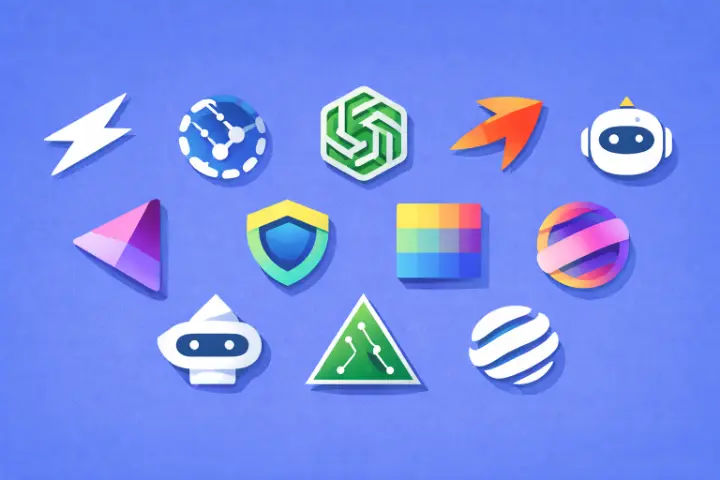
AI Companies Leading the Way
The rise of AI has brought fresh logo design to the tech landscape. Companies in the AI space tend toward abstract, geometric marks that suggest intelligence, connection, and possibility. Gradients and dynamic elements are common, reflecting the fluid, evolving nature of AI technology.
These newer logos are designed from the ground up for digital contexts, with responsive variants that adapt to different screen sizes and contexts.
Key Trends in Tech Logo Design
Several trends define tech logo design in 2026:
- Responsive logos that adapt to context
- Gradient color systems replacing flat colors
- Variable typefaces that animate and transform
- Geometric simplification for digital-first usage
- Inclusive design that works across cultures and accessibility needs
The best tech logos balance timelessness with modernity, creating marks that feel fresh today but won't look dated tomorrow.
Want to learn more? Check out our games for a fun challenge.